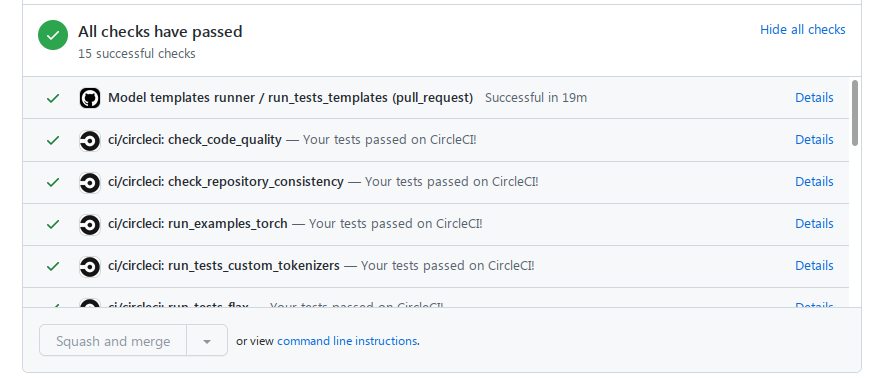
Not only now we have to click a lot more back and forth, the new UX is like going back into 1990s Internet. You can’t tell success / from failure or running quickly - i.e. visual cues were removed and status is no longer vertically aligned.
Why take something that worked so nicely and make it not so nice.
Would it be possible to make this 1990s new behavior configurable and allow users to keep the good 21 century UI?
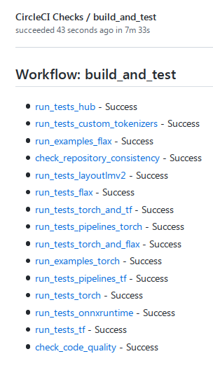
Enabling that feature automatically disables “GitHub status updates” at the project(s) level, so CircleCI will post statuses to GitHub at a workflow level rather than a job level.
That said, you can re-enable “GitHub status updates” in the project(s) settings, and have both features enabled.
Doing so will be like hoping into a DeLorean that’ll take you back to the future, thus allowing you to start receiving statuses at the job level again.
I don’t think anybody changed that setting on our side, as the behavior changed suddenly and none of us knew why but indeed following the instructions here: Enabling GitHub Checks - CircleCI and turning “GitHub Status Updates” On (not Off!) did the trick and now we have the good old UI that we love.

 Hi
Hi 